PRĒN
PRĒN: Brand Identity for a Conscious Skincare Line
Most major skincare brands treat sustainability and animal welfare as an afterthought, if they address them at all. PRĒN is a concept brand built the other way around: those values are its core design principles, not a marketing add-on. I created a full identity system to give the brand a complete starting point, from logo to storefront.
Role: Brand designer (BFA Senior capstone, sole designer)
Timeline: Spring Semester 2026
Tools: Illustrator, Photoshop, Figma, Maya, Substance Painter 3D
Deliverables: Logo, typography and color system, product design, advertisements, website design
The Gap
Big skincare brands usually present sustainability as a secondary claim on otherwise conventional packaging. I wanted PRĒN’s ethics to show in the design itself, so that someone could sense what the brand stands for before reading a word.
Name & Logo
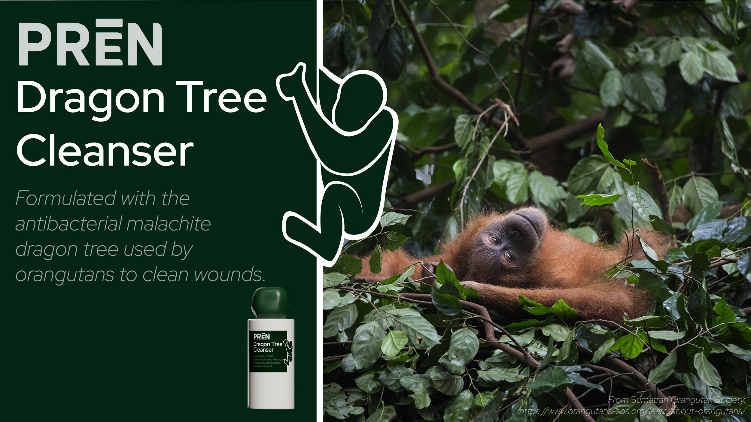
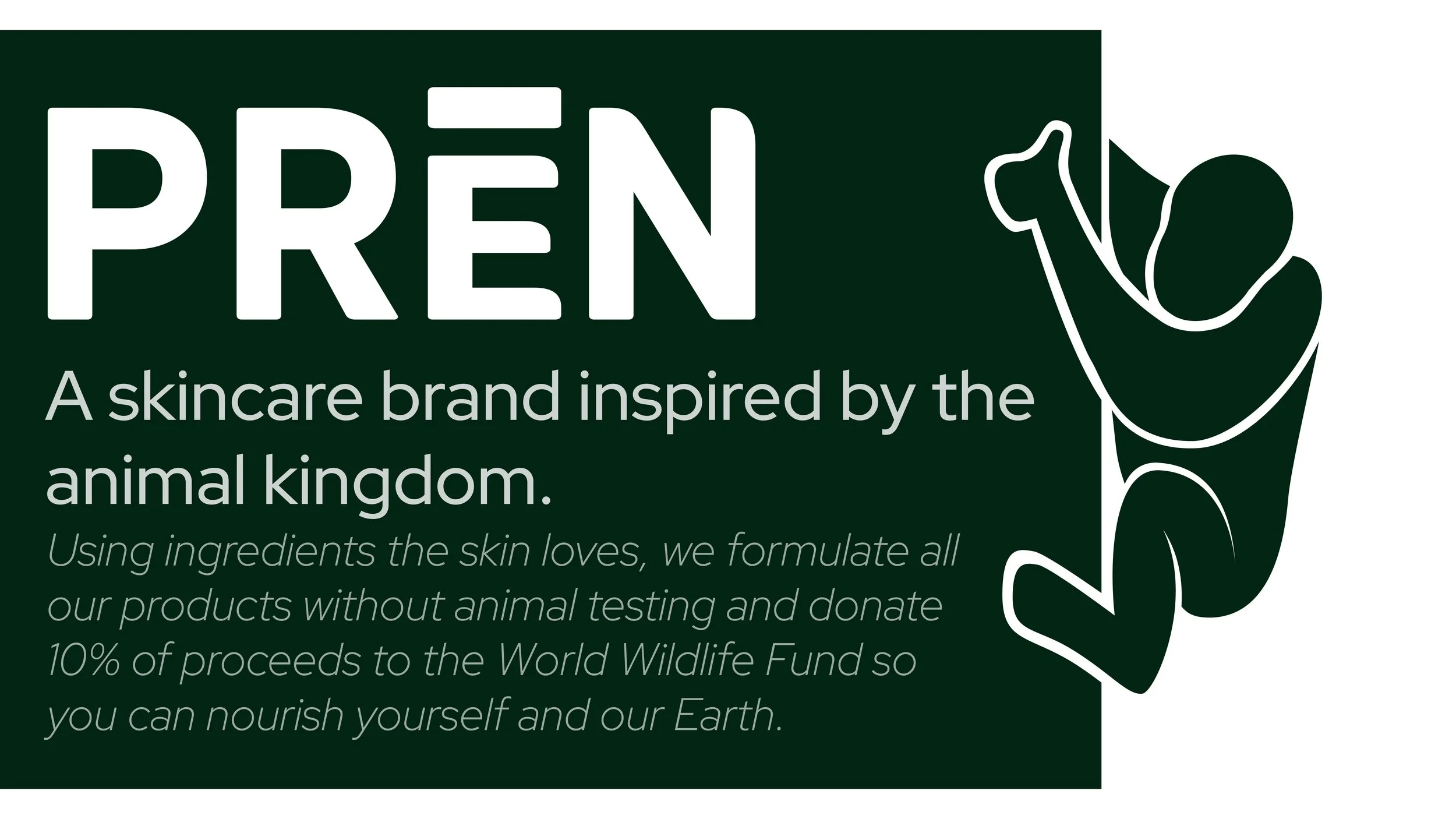
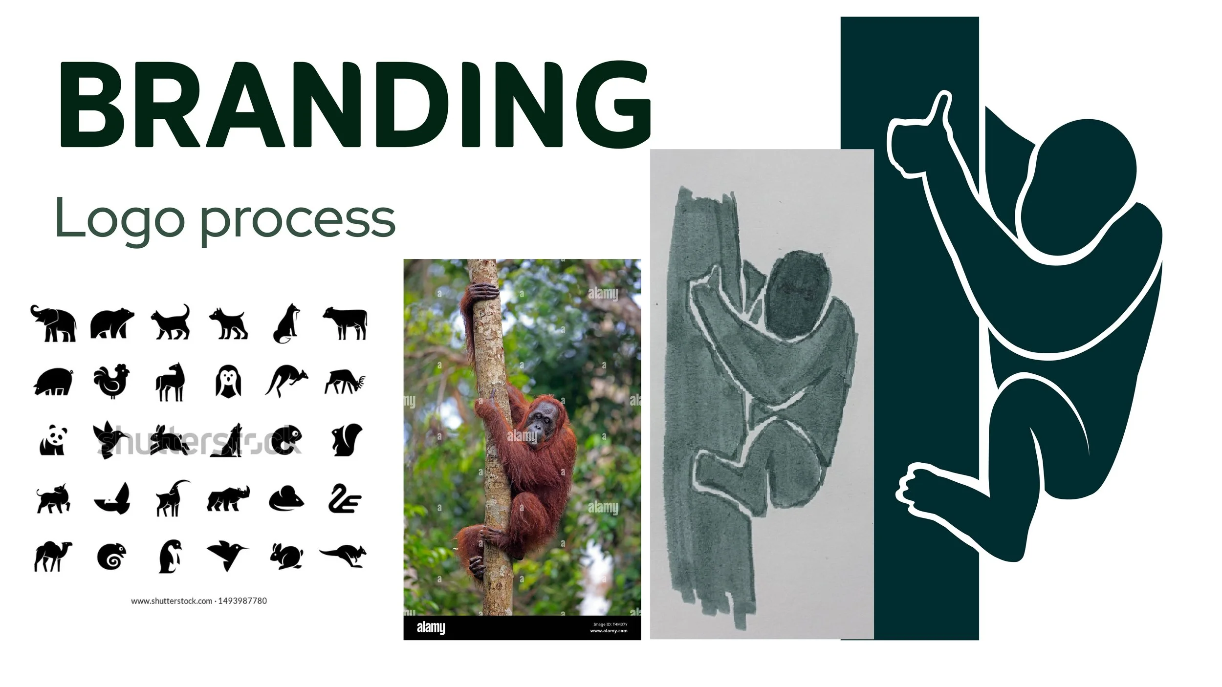
PRĒN, pronounced “preen,” takes its name from the way animals groom themselves and each other in a way that’s gentle and takes from their environment. I designed the logo to interact with the packaging label rather than sit on top of it, as it wraps around its edge. The orangutan, which inspired the Dragon Tree Cleanser, gives an immediate signal of the brand’s focus on animals and the environment.
Typography & Color
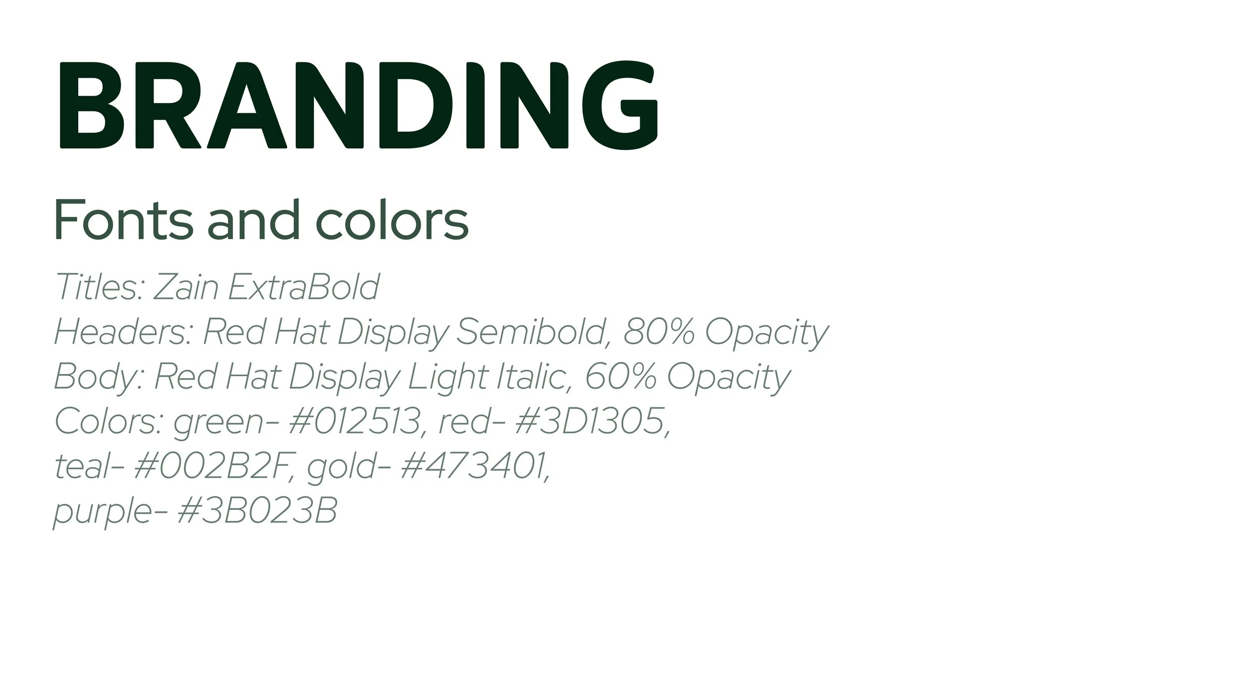
I chose a sans-serif typeface for a clean, trustworthy feel. I relied on font weight and opacity to differentiate header and body text rather than different typefaces to maintain a minimalistic feel and to reflect the simple ingredients the brand prides itself on. A soft, earthy palette signals natural ingredients, and I kept it dark to contrast the off-white product packaging.

Product Design
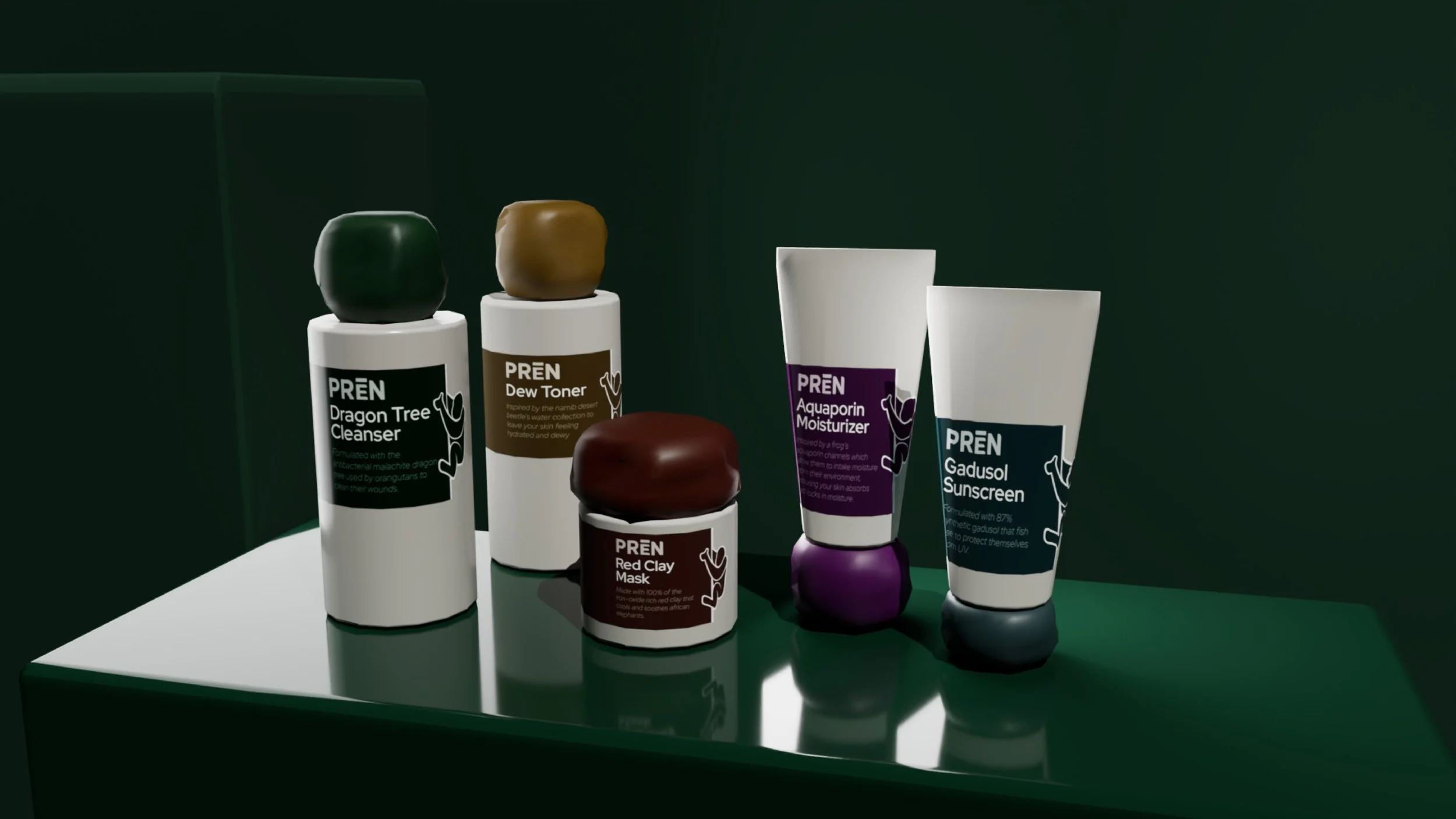
I aimed for every product to be recognizably “PRĒN” from afar with bold colors, high contrast, and unique lids.
I designed a different dispenser for each bottle according to the texture of the product. Cleanser is thicker than water and can be pumped, toner is watery and can be shaken out of a small hole, sunscreen is thick enough to be pumped, and a mask must be scooped out of an open tub.
The lids are all irregular and shaped like boulders or rocks. This irregular shape is also more accessible as it’s easier to grip than a smooth cylinder.
The containers would be made of recycled materials and use minimal ink to minimize environmental impacts.
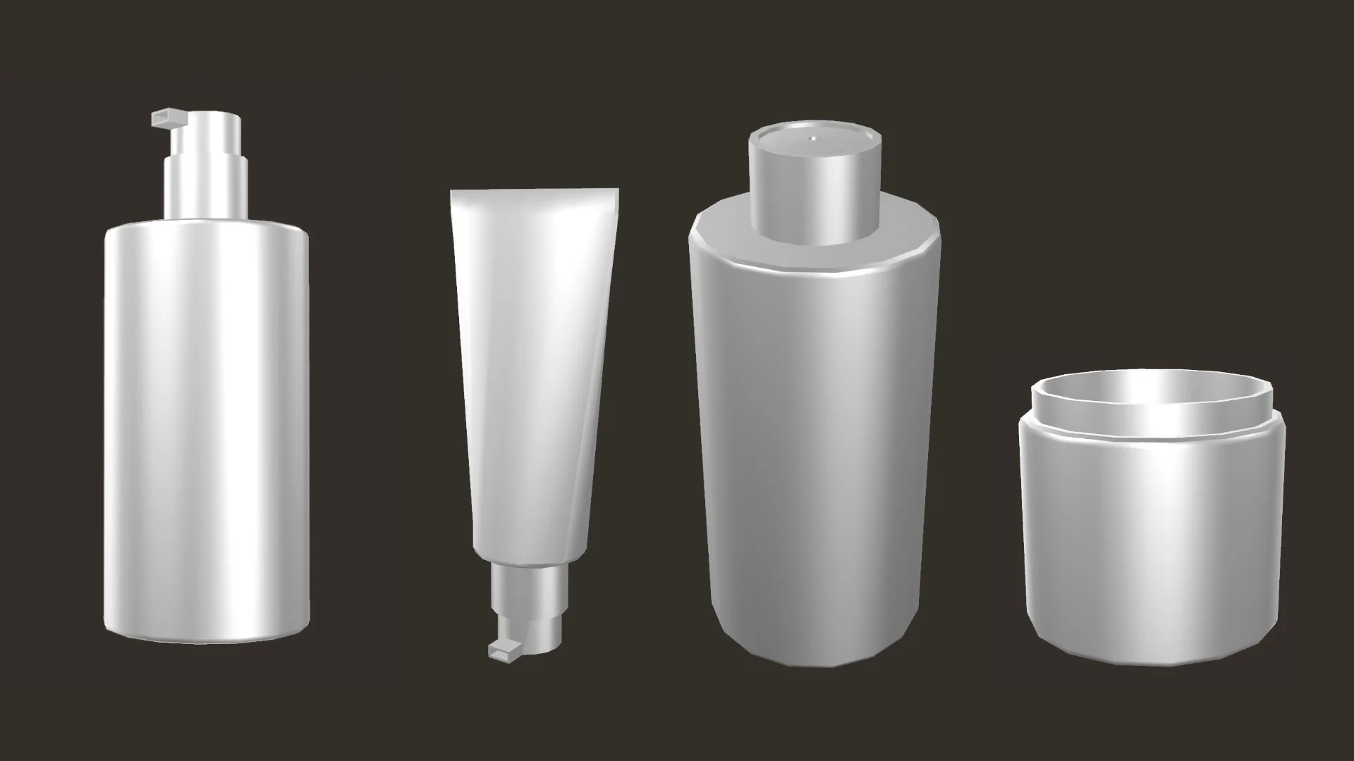
Bottle object files
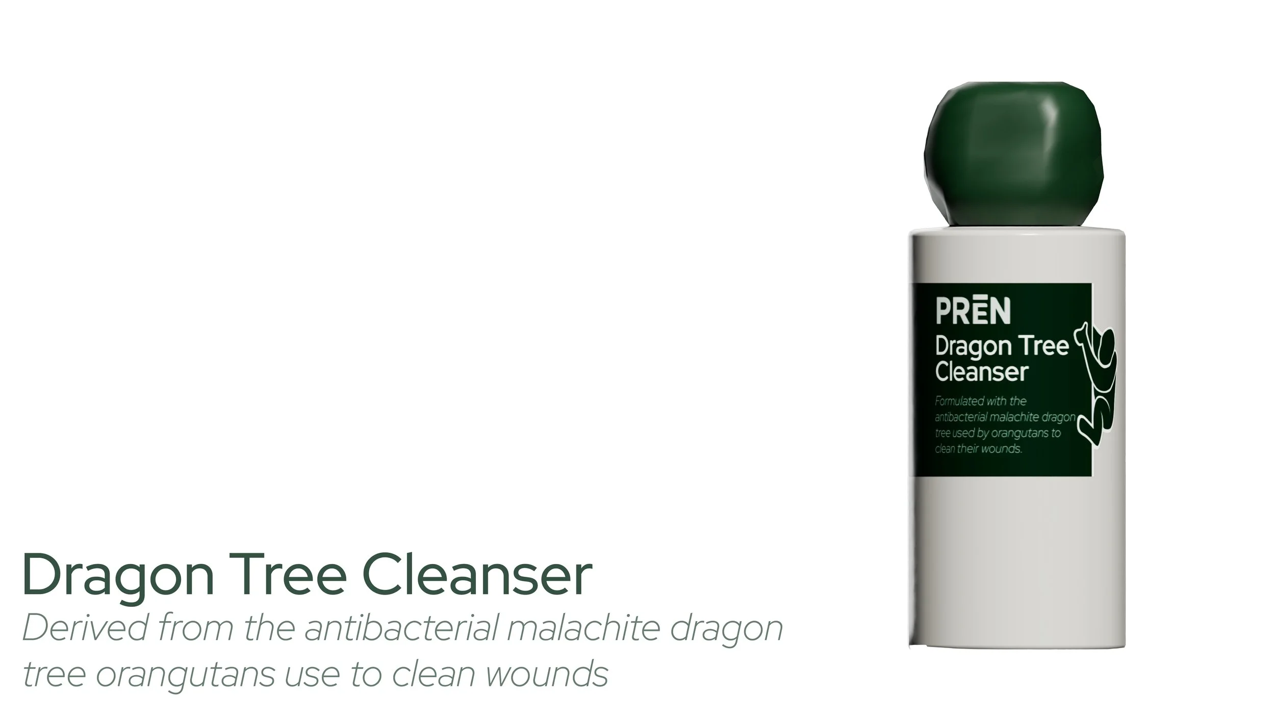
Product Card: Dragon Tree Cleanser
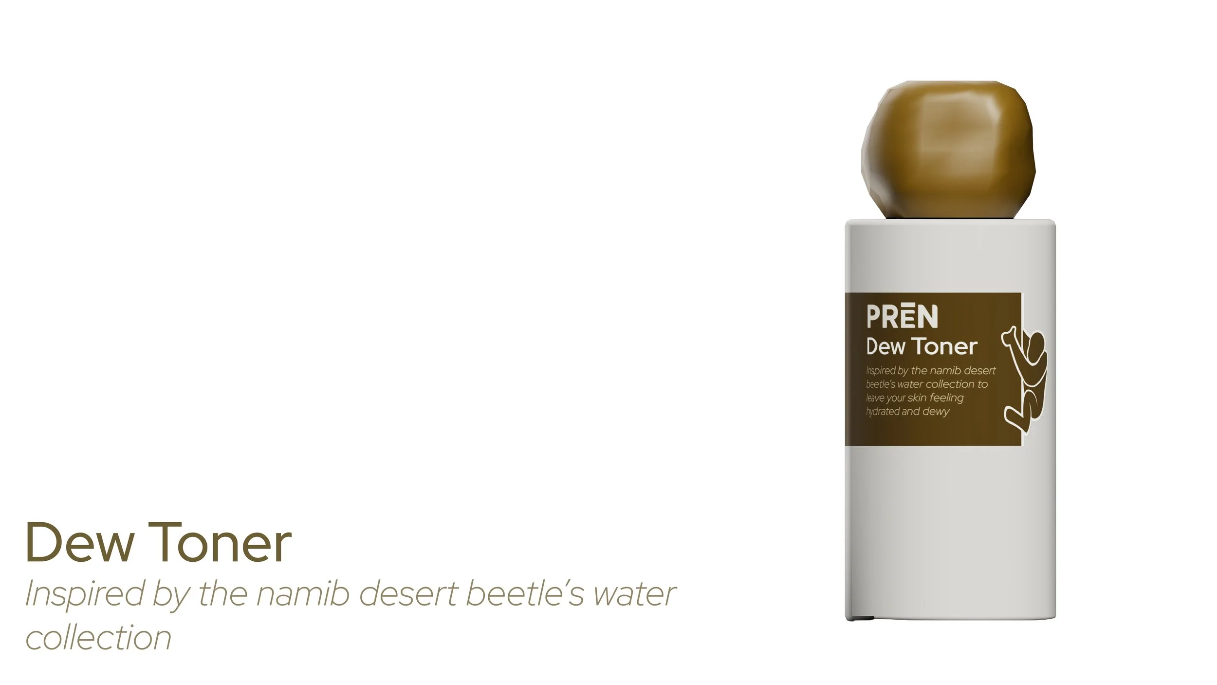
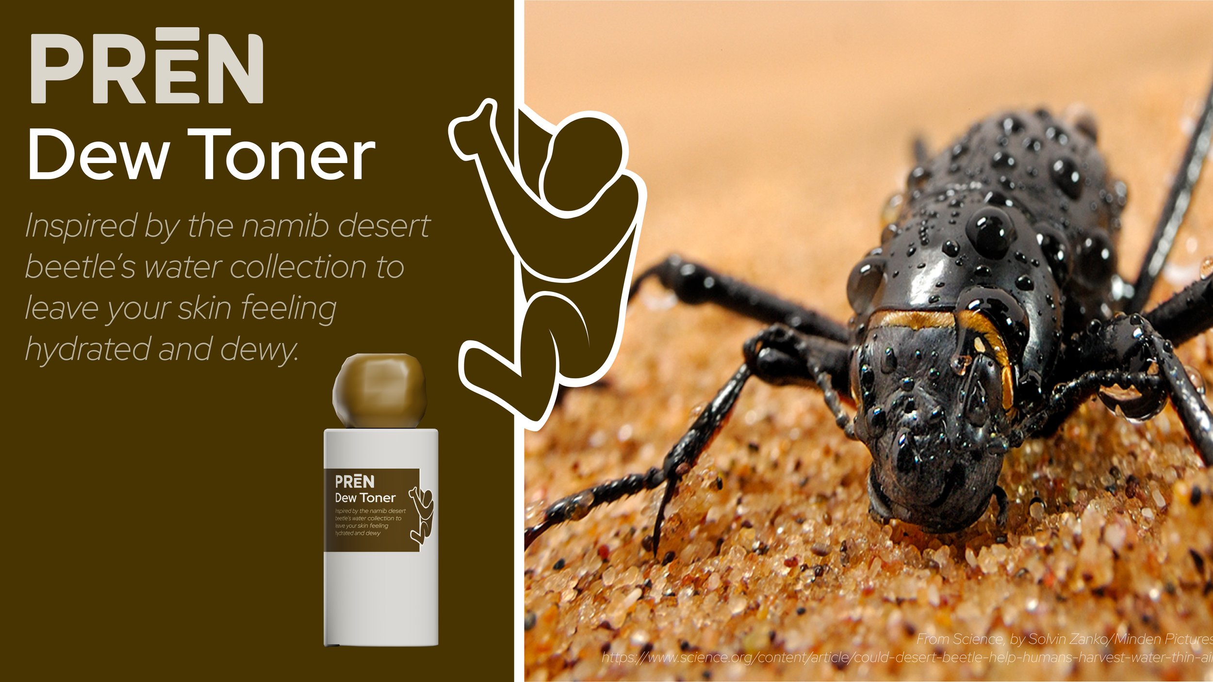
Product Card: Dew Toner
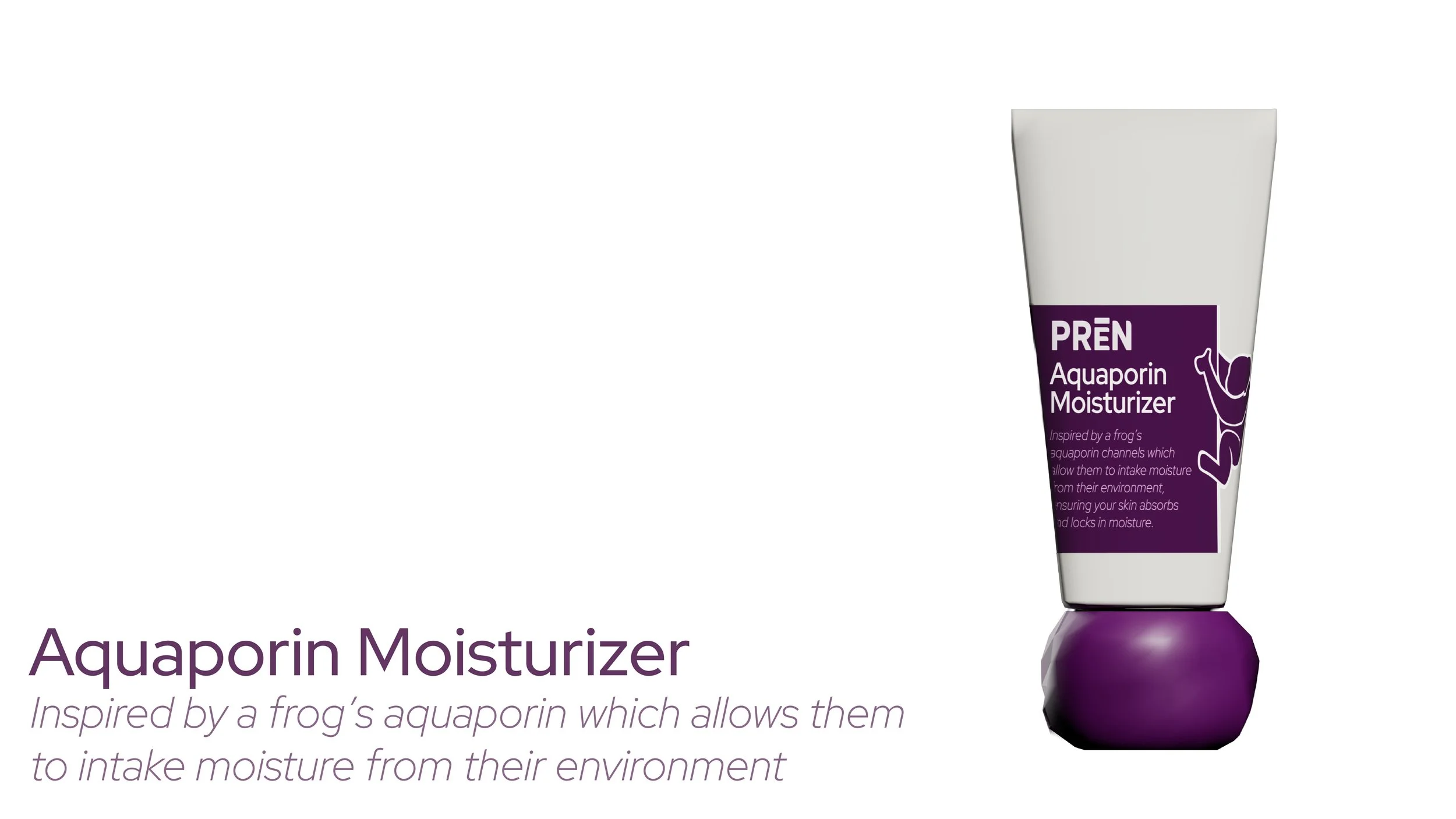
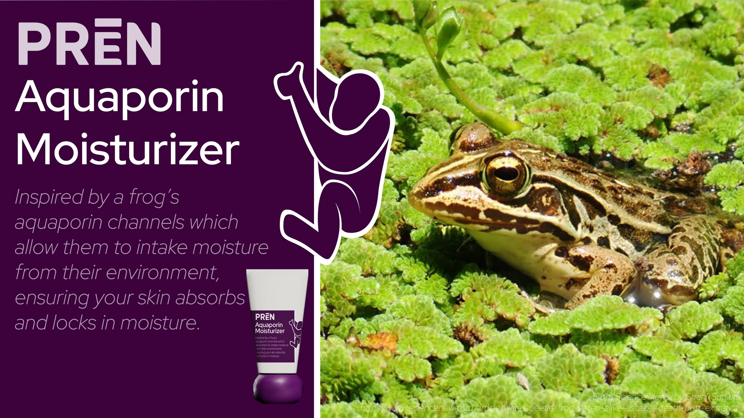
Product Card: Aquaporin Moisturizer
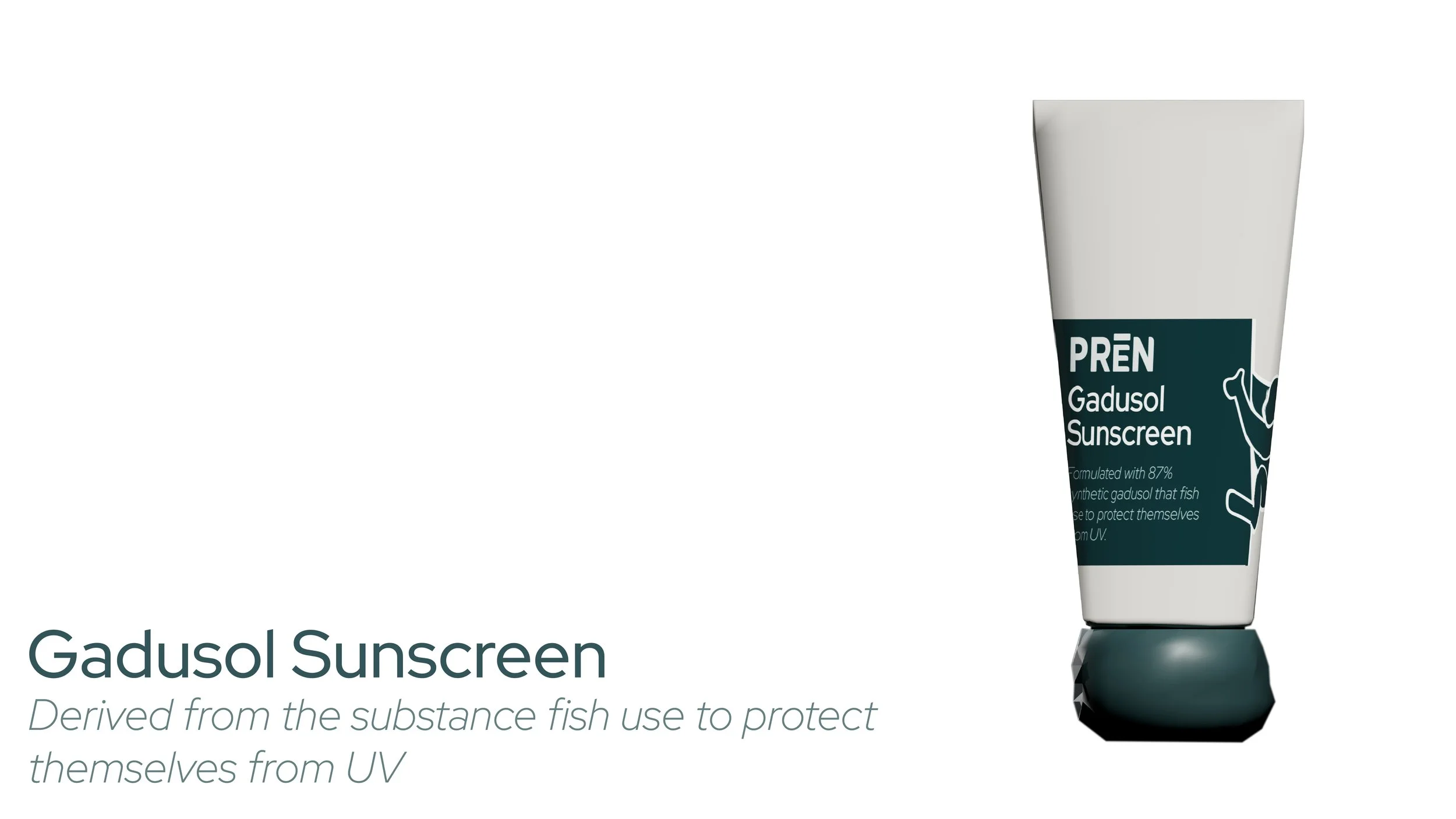
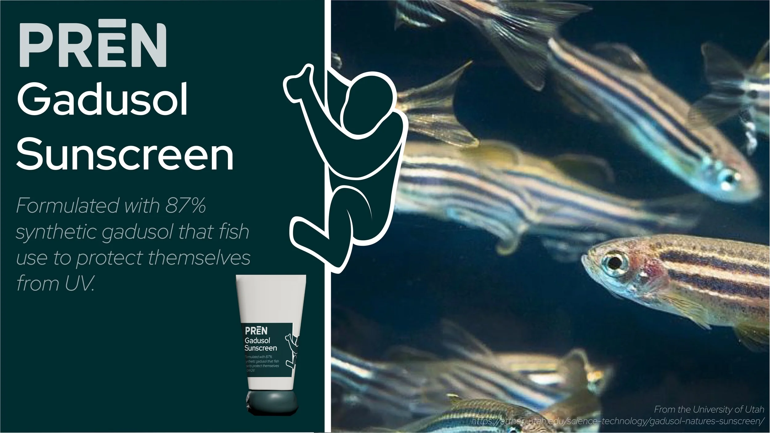
Product Card: Gadusol Sunscreen
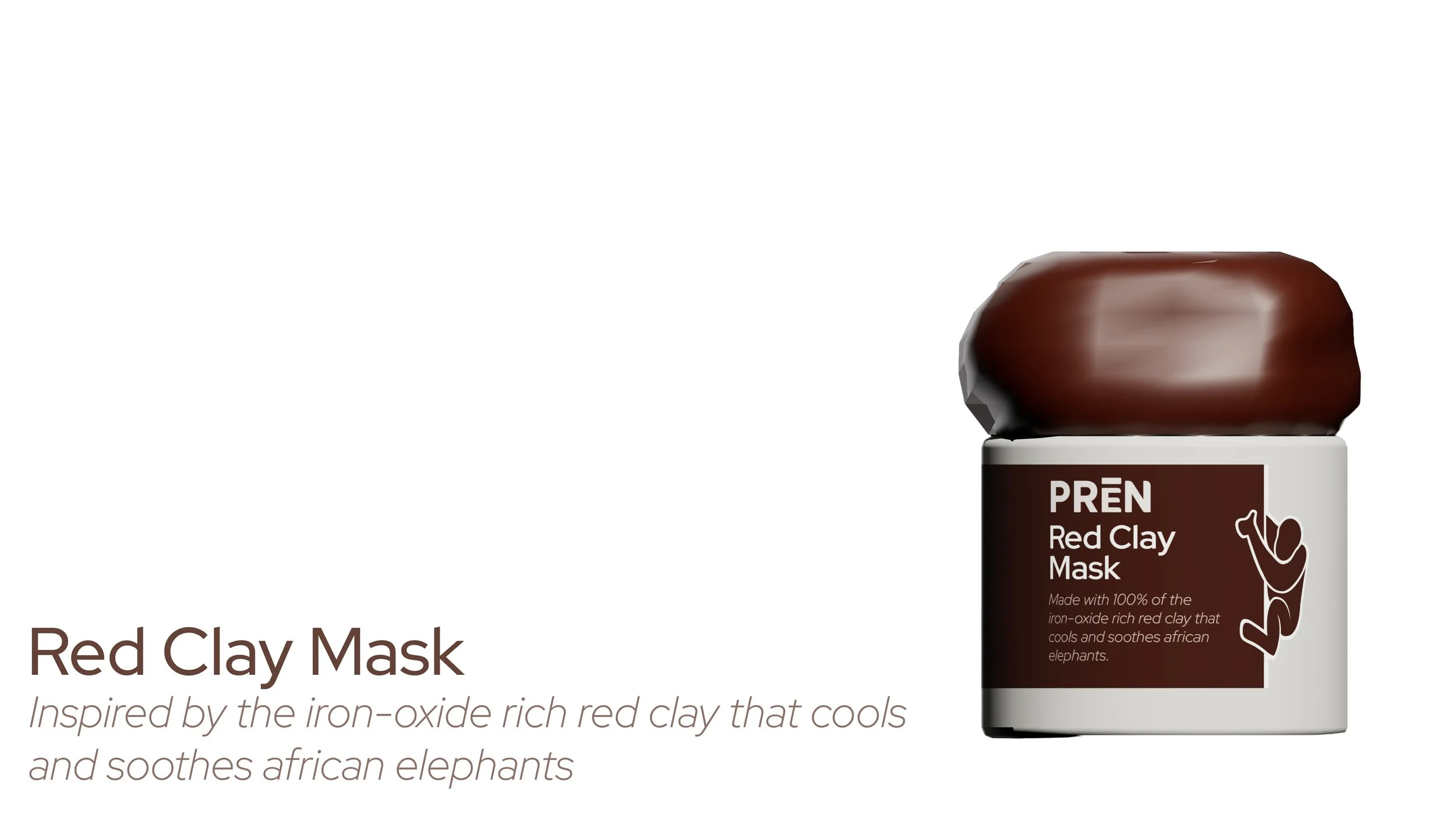
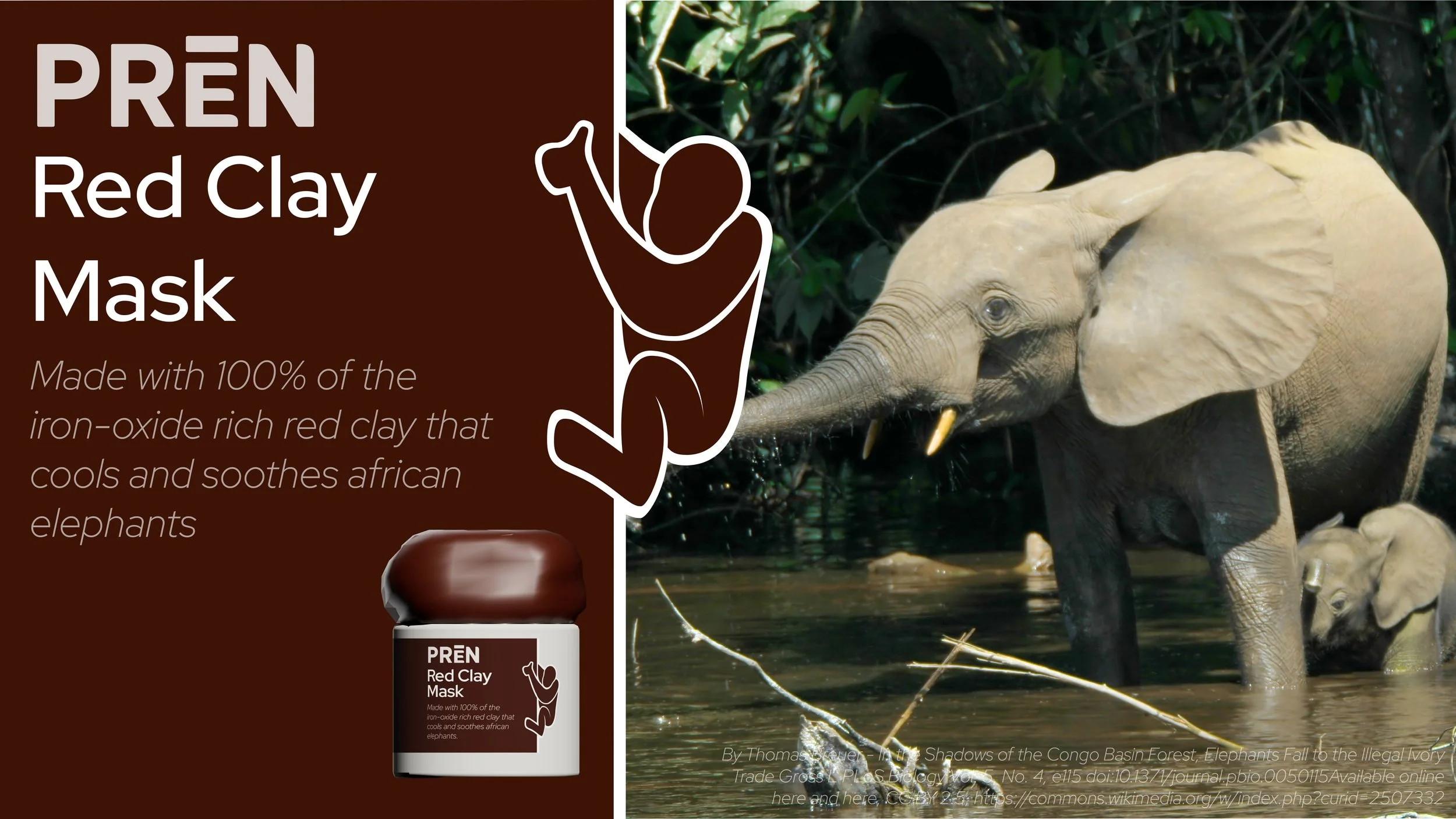
Product Card: Red Clay Mask
Advertising & Web
I extended the system into advertisements and a website design, so the brand reads consistently from shelf to screen.